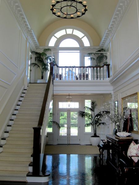
"Anatomy of an Entrance . . . "
 |
| SMW Design, East Hampton, NY. |
Greetings,
For those of you who might not know, I'm in the process of moving my office into a larger space - and expanding the staff a little bit. That's the good news. The bad news is I'm moving my office into a larger space and having to go through what seems like billions of pieces of paper in the process. Invoices. Receipts. Workroom orders. Pizza delivery menus. You can well imagine!
The fun part is that I'm finding all manner of pictures and hand-scribbled notes from past projects - including this little progression of the entrance to one of our projects in the Hamptons . . .
 |
| Here's what we started with. Beautiful architecture. A paint colour that we needed to tweak a tiny bit. And a few pieces of existing artwork. |
 |
| Here's how it turned out. We just added flowers and decorative pillows - and the space feels perfect. A play of dark and light. Antique and modern. Formal and casual. |
 |
| And the mirror-polished herringbone floors don't hurt either . . . lol . . . but, with sensible sisal carpets at the entrances to keep and sand out. Cheers, Scot |


Comments
I have the details on the pillow textiles at the office - I'll get you the info tomorrow!
Cheers,
Scot
Everthing you do is perfect! Good design makes people happy.
Greetings from Belgium
Jérôme
Congratulations on the growth of your business. Lovely space. I have been looking for a creamy pale yellow paint and I love your choice. Will you share your color? I find it difficult to get yellows and white to look good together, any suggestions?
~ ~Ahrisha~ ~