"Aw, Lighten Up . . . "
Greetings,
I quite often read design magazines from back to front. I think I always have. I want to see the features first anyway, so I usually just start leafing through starting from the back page. That's not really the point if this post (an exploration of my idiosyncratic behaviour could fill numerous entries!) - but, it does mean that I often see an article before I see the title page - so a few weeks ago when I was leafing through the San Francisco Chronicle home section (from back to front) my thought was - "wait. I think I know that house!"
Well, 'know it' I most certainly did. It's the place that belongs to my friends Patrick Wade and Paul DeMattei - a 1905 Edwardian in the Ashbury Heights area of San Francisco.
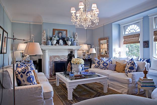
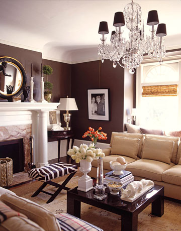
You might recognize it as well - here it is several years back when it was featured in House Beautiful - all dark and dramatic and delicious. Sparkling crystals and polished silver shining against dark chocolate walls. A gleaming lacquered coffee table balanced by soft wool carpets.

But, good grief! Look at it now. Bright. Cheery. So often, in the design business, we preach about the power of a fresh coat of paint and some new decorative pillows - well, here's the proof. Clearly Patrick and Dave did more to their gracious home than just a few cans of paint and some textiles - but, it truly shows what you can accomplish once you embrace the idea of 'change.'

before.

and after.
No big changes in the dining room. But even simply re-hanging your
artwork can help the house feel new.

the beautiful library table in the entry. Classic raffia wallpaper and
beautiful period woodwork in glossy white.
before.

In the master bedroom, again not any dramatic changes. But many times, no big changes are really needed. Fresh, new bed linens can make all the difference.
So take a look around you house - maybe this weekend is the perfect time to add a little something new . . .
cheers,
tartanscot
Photography for SF Chronicle - Peter DaSilva
Photography for House Beautiful - José Picayo


Comments
Karena
Art by Karena
Fun to see it here again...
Ok, now on to the magazine reading format! Every magazine or catalogue I pick up, I read this way. But, only after I first go through and pull out all the annoying perforated subscription cards...do you do this as well?
I read the above comments and it seems we are not alone...something in a designers DNA I wonder???
Until my sister pointed it out a few years ago, I didn't even realize I was doing it. I've tried not to...you know feeling like a weirdo...but I always go back to...backwards!
Yep, blogworld...it's where your "people" are!!!
Glad to see that the reading of shelter mags from back to front may be the industry norm! And, yes, all of the cardboard effluvia has to be removed first . . . lol.
And, yes, that may be one of my favourite kitchens ever, anywhere. amen. bright. functional. stylish. You kinda can't beat it.
Cheers,
Scot
I usually flip to the featured homes first then hit the front...but I'm with you. Get rid of the damn subscription cards !!!
This latest transformation is indeed fascinating.
It is, I believe, at least the fifth variation.
I published the second version (designed with the assistance of Stephen Brady) in one of my earlier books, San Francisco Style, I think. Putty colored walls and lots of urns. Master bed at that time was a pencil post four poster. I must look through my files. It was also published in Met Home in the third variation (more Williams Sonoma Home, with chinoiserie chairs)
Dave and Pat now live in LA...and this house is their true home base. Great to see the blue and white.
cheers, DIANE
www.thestylesaloniste.com
I like it when it's messy
its amazing what small changes can do....it was a really beautiful home they have:)
have a nice evening..
eddaHugs to you from Oslo,Norway...
Lila Ferraro
Queen Bedroom Sets
I just wanted to comment that after several ungodly attempts to listen to your interview with the Skirted Roundtable on my iphone... I finally resorted to my computer to listen. I use an air card since I live in the country and anything streaming eats up my allotted usage before going over... it was well worth the effort. I really enjoyed learning more about you and how you operate as a designer. Your "people" style is certainly reflected in your warm and inviting interiors. Terri
This has long been one of my favorites houses. I always loved the brown (my living room is quite similar by coincidence) but the blue completely changes it and freshens it up. It's got me thinking.
I also love the Phillip Jeffries wallpaper and I will have it one day. The kitchen is perfect. Perfect! And the photo of King E. and Mrs. Simpson is so romantic.