"The Library - Before and After . . . "
Greetings,
I'm always fascinated by the analytics that accompany writing this blog. Sometimes my business degree gets the best of me - and I can spend hours digging through number and analyzing data. Seeing which country has the largest readership. Knowing which images on my Pinterest page send the most traffic to the blog. What time of day I tend to have the most readers. To know that y'all like it when I use images from Downton Abbey. And I also love seeing which of my numerous posts get the most readership . . .
So . . . though I don't quite consider this as pandering . . . I DO know, for a fact, that y'all like a good ole "before and after" story . . . lol.
So. Here is some fairly serious 'before.' Just after the beginning of construction. Mocking up some trim options - and finalizing the shelving layout for the new library. The wooden mantel was not going to be re-used, but because everyone involved liked the proportions - we were using it just as a place-holder until the limestone one was delivered. We were also working with the shelving layout - and I was measuring all the books and artifacts that were going to end up being used along this wall.
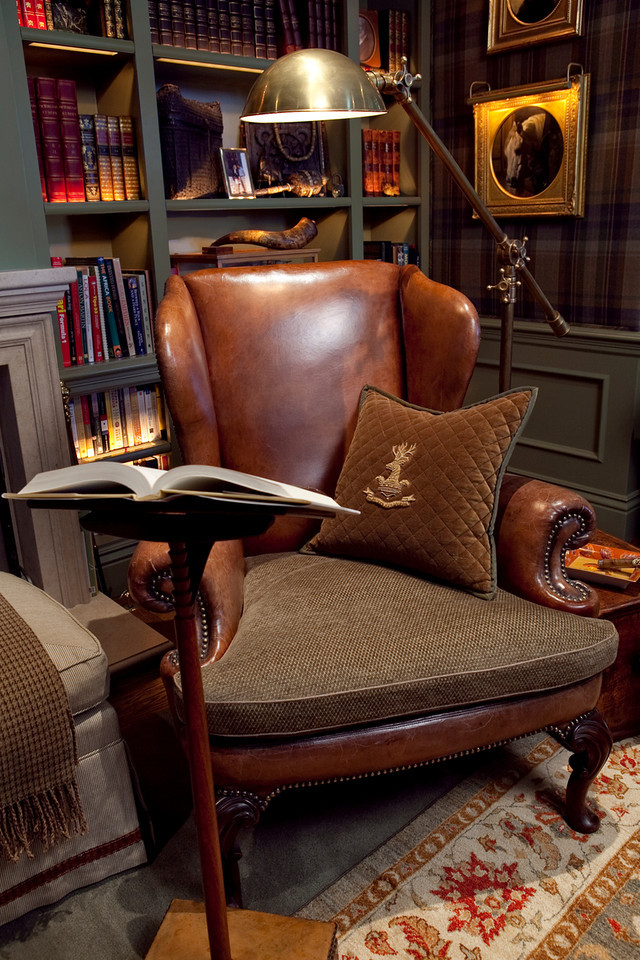
And now . . . a beautiful, rich paint colour for the woodwork. We had toyed with the idea of a stained finish on the woodwork - but, there were also a great many other details for the room (custom upholstered tartan walls, a large collection of antique books, and so forth) and decided that the painted woodwork would be less of a 'design element' - and thus would function more as a supportive detail than a 'marquee' one. It's always important to keep the entire project balanced. The painted finish also gave the space a slight 'modern' element - to contrast with its eventual furnishings.
Because, now things are getting serious. Almost 100 yards of a custom plaid were being milled in Scotland - a mixture of rich olive greens, russet browns, but with just a hint of soft lavender to keep things interesting. The entire room was measured and graphed out - with all the seams and welting calculated. So that . . . over the course of several weeks . . . we could do this . . .
All dressed for a classic gentleman . . . and his retreat from the busy, modern world. The painted panelling recedes - and the furnishings and collections leap to life in the space.
Cheers,
Scot


Comments
I'm just a little mommy blogger, but I'm always fascinated by the analytics side of blogging too, (I blame my sociology degree), my favorites are the random things that people search for in google and wind up on my page!
A mi, no me preocupa quien visita mi blog! Me divierte! No me obsesiona!
Quizás.... porque solo soy una madre...
Un besito
I just love the color you picked for the shelving. And the fabric being custom milled...I imagine that was so much fun to decide what to create! Beautiful, as always.
I think I can make you love the room just a slight bit more. it's not wallpaper. we upholstered the walls in custom wool plaid from Scotland. lol.
Cheers,
Scot
Love it.
The choice of using fabric on the walls is brilliant, too, since it absorbs sound so much better.
And explaining all the planning that goes into creating a successful room is so helpful. Too many people think anyone can be a decorator given a yardstick and a tax number!
April, Just Verte Style
Love this project, and you are right we all love a good "reveal". Beautifully done!
The two tufted leather sofas are, in fact, not a pair at all. The larger one is a traditional 'Chesterfield' style while its mate is actually more of a settee. Both both are antique. The sofa belonged to the household long before I started the project - and the settee was sources here locally in San Francisco from Garden Court Antiques.
Cheers,
Scot
Love it so much!
Jan
By the way, don't worry about pandering to your audience. That only applies to posts that please other people, but not me. As long as I like it, it's not pandering. Carry on.
and you did not disappoint, brilliant!
debra
A not surprisingly stunning room! Love what you did here.
Have a wonderful weekend.
Teresa
xoxo
Amazing to see the "before"!!
A lil question, im one of your followers from over the pond...and would dearly love to know the name/no brand etc of the charming grey/green you used.
Oliver Thomas :)
you layer a room. and it's always just enough. and it looks lived in.
and it looks evolved.
the best kind of compliment.
kudos you handsome designer. kudos!
Yes - the lighting on the shelving is placed in an exposed, open groove just behind the front edge of each shelf - so that it casts its light both above and below.
Cheers,
Scot
Unfortunately, the paint was a custom colour.
Sorry!
Scot