"It's In the Mix . . . "


Greetings all,

I was delighted to attend an insightful lecture from Eric Cohler at the Lee Jofa showroom during "Design San Francisco" last week. It was an hour packed with inspiration - but one particular quote of his seemed to resonate with me - "We all need a past in order to find the here and now." It was an expression of that 'duality' in design that many of the week's speakers all seemed to touch on. Mixing periods. Mixing styles. Mixing colours. Mixing patterns. And creating energy from that tension. Finding great style in that contrast.

Here are some perfect examples from Cohler's own portfolio. Such a great talent. No wonder he's referred to as "The Mix Master."

Classic oil paintings, but hung on grasscloth wallpaper.
European bombe chest paired with contemporary upholstery and lighting.

Love, love, love.

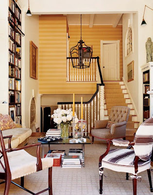
Classic space. Classic furnishings. But, paired with horizontally
striped wallpaper for some contrast and energy.

This might be one of my favourite images from Cohler's portfolio.
I love this collection of vintage photography and prints, but displayed with
just a clean modern eye. And pairing them with the geometric floor covering
is just genius.
Simply lovely. But the use of the photography over the mantle
gives it much more edge. and interest.

And this is just storage porn from Cohler's own home.
(oh, if I could only convert a bedroom into a closet!)
And a bit of shirting envy as well.
(with a great use of wallpaper on the ceiling!)

Keep mixing,
tartanscot

here's a bit more information on Cohler's collection for Lee Jofa Textiles.

Comments

columnist said…
I've always admired the picture hanging in the first photo - a complete disregard for the "normal" height of pictures, but rather using them as wallpaper. I am just a bit terrified that people lean against (good) pictures and damage them, so the criterion must be that the room or passageway is wide.

As for the shirt storage! Yikes, who has so many?! They do however make a pretty decorative scheme.
modGIRL said…
Great post and pics. What amazing talent!!
Amazing - I love rooms that have a collected 'mix' feel to them. Those doors to the bedroom are incredible as well!
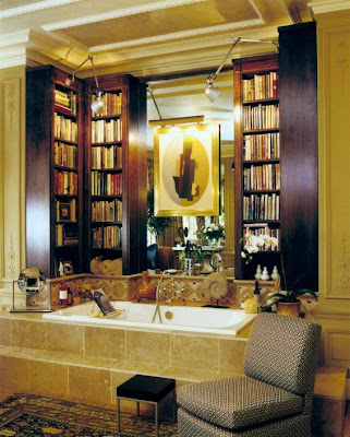
Love his work! I particularly love the bathroom with the library... books work everywhere and add such depth to a space.

The bedroom is also a fabulous space... but I'm still trying to figure out why the base trim is cut short on the lower left wall in the hallway. Perhaps it was added temporarily for the photo shoot and they just ran short on the length.
Karena said…
I agree , love the art gallery wall. very clean and crisp. beautiful work by a great designer!
Karena
Lisa Porter said…
Just beautiful. My heart is a pitter-pattering over the oil paintings on grasscloth, the bath library, the stair runner. He is a mix master! Thank you for introducing me to the very talented Mr. Cohler, I look forward to enjoying his portfolio.
Have a great week Scot!
Lisa
Jaime Rogers said…
The bookcases around the bath are divine! Eric Cohler's work is perfectly fresh and classic at the same time. I also really enjoy the stairwell and the papered ceiling in the dressing room...yes, the dressing room with the ridiculous amounts of shirts, lol!

Regarding his philosophy, I always inform my client's that every antique was modern design at one time....

Besos,
Jaime
Fantastic post. Thank you for sharing. Maria
Unknown said…
Love, love, love the books above the tub! Id never leave!
La Maison Fou said…
Nice looks love the grass cloth on the hallway walls.
Looks so inviting, and yes I need an entire room for a closet as well.
L.
Your favorite image is also mine! So glad I stopped by.
indeed one of my favorites also.

:-)

David

Popular Posts